Wild Zombies mobile characteristics
Vertical feature introduction
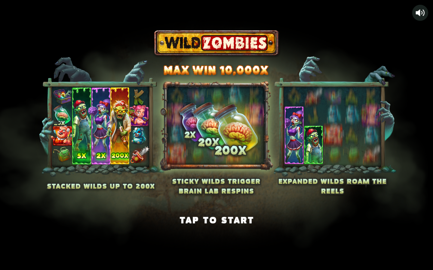
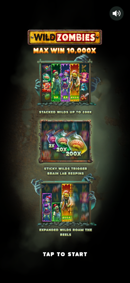
The official mobile demo opens with the Wild Zombies logo and 10,000x maximum at the top. Three feature panels follow in a vertical sequence: Stacked Wilds up to 200x, Sticky Wilds with Brain Lab Respins, and Expanded Wilds roaming the reels. Tap to Start appears below the final panel.
This arrangement uses the full portrait width without shrinking three complex illustrations into one row. Each panel receives enough height for character stacks, Brain Jar values and explanatory labels. The dark background separates the feature cards and keeps the hazard-yellow logo visible.
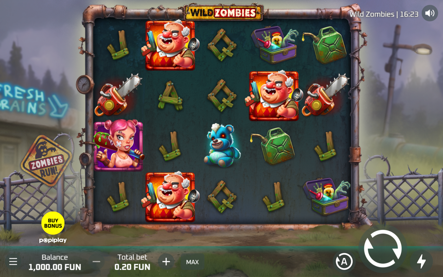
Responsive 4x5 reel board
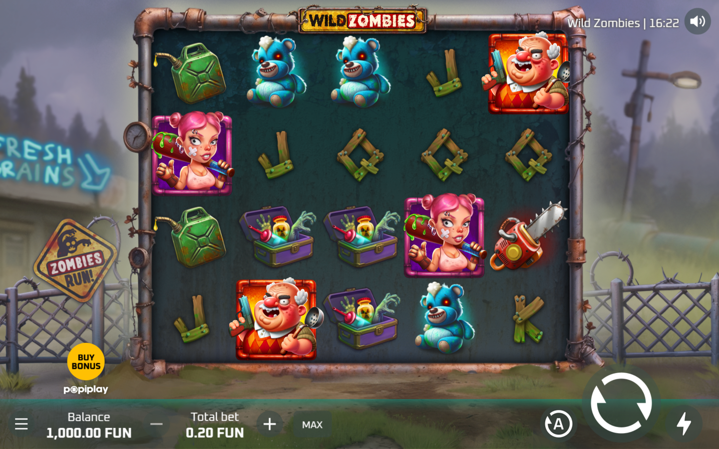
After the introduction, the same five-reel, four-row grid scales into the available mobile canvas. Twenty symbol positions remain part of the product, and the 16 paylines retain their role. The board can use most of the viewport width while balance, total bet and feature controls move around its edges.
Character art relies on large silhouettes and coloured borders. Cheerleaders use magenta, doctors use orange, and glowing bears use cyan. Wooden letters and utility symbols remain visually simpler, helping high and low symbol groups stay distinct on a compact display.
Android display characteristics
Current Android screens vary widely in aspect ratio and pixel density. Wild Zombies uses a scalable canvas so the intro, reel frame and touch controls can fit tall and compact viewports. The feature panels maintain a fixed visual order even as their rendered size changes.
The spin control is large and separated from bet adjustment, autoplay, sound and menu actions. Bonus Buy also uses a distinct yellow button. Stable control zones prevent changing win values or symbol animations from shifting the main interaction areas.
iPhone display characteristics
On iPhone viewports, portrait orientation gives the 4x5 grid a central position while safe-area and browser space remain around the canvas. The mobile introduction already matches a tall-screen composition, so the logo, feature summary and start action do not depend on a desktop side panel.
High-resolution artwork preserves slime, metal and character details, but symbol recognition is based primarily on colour and shape. The green fuel can, orange chainsaw, cyan teddy bear and framed zombies remain distinguishable after responsive scaling.
Touch controls and feature access
The desktop demo places Bonus Buy at the lower left, the main spin control at the lower right and total bet controls along the bottom. A mobile layout can reposition these actions while retaining their visual separation. Large circular targets suit touch interaction and keep labels outside the symbol cells.
Free Spins Boost, Wild Spin and Bonus Buy remain product features across responsive layouts. Their current options appear inside the loaded interface. The mobile product does not require a separate feature vocabulary or different mathematical profile.
Mobile feature and performance layout
The portrait intro uses one image panel at a time vertically, reducing visual crowding and preserving text size. During play, the reel canvas becomes the priority and secondary scenery can crop around it. This keeps the active symbols, counters and multipliers in the readable area.
Critical product information on this site is present directly in HTML, while non-hero images load lazily with reserved dimensions. This reduces layout movement. The mobile facts remain consistent with desktop: 4x5 grid, 16 paylines, high volatility, 97.06% RTP and 10,000x maximum win.